Sunday, April 29, 2012

I got Rhythm!

Rhythm... strange word isn't it? The spelling.. the meaning.. many things about it are just odd. I mean, automatically you assume that when someone is talking about something having "rhythm" that they are talking about music. And they probably are..because that's the most discussed and most known definition. But there is rhythm in design. Did you know that? I didn't. But the connection between visual rhythms and musical rhythms can be more than a simile or metaphor.1

Rhythm in design means that there is a repeating of a certain theme or motif in a design.1

And just like in music, rhythm often evokes emotions. When a visual experience actually stimulates one of our other sense, the effect is called kinesthetic empathy.1

Lauer, David A. "Chapter 6, Engaging the Senses." Design Basics. 7th ed. New York: Holt, Rinehart, and Winston, 1979. 114-22. Print.
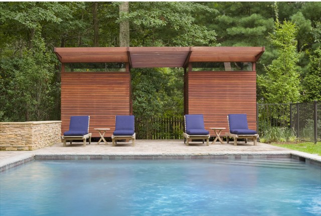
Like in this picture... this design evokes emotions. Relaxation, calmness, peace. This is an example of kinesthetic empathy. Joanna, "Handcrafted Rhythm in a Tropical Retreat." Interior Design Daily. March 30, 2011. April 29, 2012


Alternating Rhythm consists of successive patterns in which the same elements reappear in a regular order. Motifs alternate consistently with one another to produce a regular (and anticipated) sequence. The predictability of the pattern is necessary  The repetition must be fairly obvious or the whole idea of visual rhythm becomes obsure.1

The pictures on the wall of this picture show Alternating Rhythm. Each picture is the same framing and theme, but different colors change the look a bit. But the pattern is predictable enough to anticipate the rhythm of the design.

A designer's world: Interior Design, "
A Little Inspiration For The Designer In All Of Us", April 29, 2012


Progressive Rhythm is the repetition of a shape that changes in a regular manner. A feeling of a sequential pattern. Most often achieved with a progressive variation of the size of a shape, through it's color, value, or texture could be the varying element.

A designer's world: Interior Design, "
A Little Inspiration For The Designer In All Of Us", April 29, 2012

Polyrhythmic Structures are complex patterns employing more than one rhythm or beat. For Example:
doublemesh.com, "Impressive Patterns Interior Design by Colour Courageously" , April 30, 2012

Notice the different angles and circles, the different colors... yet the circle in the cube match the wallpaper, the variety of the rock art matches the wallpaper, the structure of the chair matches the wallpaper. The "poly" is the different shapes and colors, the "rhythmic" is the repeating patterns.


As an interior designer, rhythm will be very important. You want your client to be able to feel emotion when in their home or business. I believe that I will be using polyrhythmic structures the most in design. Different shapes, patterns, colors dictate polyrhythmic structures and are constant in interior design.

Sunday, April 22, 2012

A few extra things...

So you have a large object in the center of your room and you need to balance the room? This happens quite often in bedrooms. One option is using Balance by position.  This is done by balancing a large object (like the bed) with smaller objects on the outer edge, as shown below..


Designexclusive. "Ultra Couture Design." Web log post. Ultra Couture Design. Onsugar. Web. 23 Apr. 2012. http://designexclusive.onsugar.com/.


and another thing.. just for fun.. Showing how you can make something large look small - in a matter of scale.


Browning, Brenda. Small Gruene Tower. Digital image. Web. 21 Apr. 2012.

Thursday, April 19, 2012

BALANCE < = >

BALANCE < = >


This may be the hardest concept I will have as a new Interior Designer. Why you ask? Because I am relatively OCD about things balancing symetrically in my home decoration. If something is on the left, it must also be on the right. If there is a certain color on the left, it must also be on the right. This isn't because I can't appreciate it when it isn't.. it just is my preference. But it even comes down to things must be completely centered on a wall...furniture, artwork, etc. It is a blessing and a curse.

Balance - by definition refers to the distribution of visiual weight within a composition (1), but this can be achieved several ways.

(1) " Balance ". Design Basics. 7th Edition. Lauer/Pentak. 90. Print

Symmetrical Balance

This is probably the most recognizable balance trait in interior design. Basically..whatever you have done on the left, do again on the right. You fine this design in artwork, furniture placement, etc.


Eisner Designs. "Design Photography: Let's Get Symmetrical." Houzz. Web. 20 Apr. 2012. http://www.houzz.com/ideabooks/905184.


Asymmetrical Balance

Asymmetrical balance is achieved by different types of items with similiar visual weight or attraction to the eye being used horizontally or vertically to create picture. In the picture to the left, the strong room dividing wall is balanced by oversized light fixtures and table on the opposite side of the room.


"Interior Design Ideas, Tips & Inspiration." ChicTip Interior Design Blog. Web. 20 Apr. 2012. http://www.chictip.com/page/2.


Balance by Color or Value
Just as in asymmetrical balance, the balance of the room can be achieved by color. As in this picture to the right. The strong orange color on the right wall is balanced by the white sofa and chair on the left. Even though there is minimal furniture on the right, the color on the wall balances the strong furniture on the left.

"Decorating 101: Color Wheel, Value and Balance." Interior Decorating Ideas, Interior Design and Interior Decorating Tips, Home Design, Room Ideas for Your Inspiration– InteriorHolic. Web. 20 Apr. 2012. http://www.interiorholic.com/decorating/decorating-101-color-wheel-value-and-balance/.

Texture and Pattern

When decorating with strong patterns and textures, you can achieve balance by equalling a texture on one side with a pattern on the other. In the picture above, the heavy fireplace rock wall is balanced by the large pattern on the rug.
"HOMESLICE." : December 2011. Web. 20 Apr. 2012. http://heyhomeslice.blogspot.com/2011_12_01_archive.html


Radial Balance

Radial balance is achieved by objects radiating from a center circular object. It is not confined to symmetrical or aysymmetrical designs as it can be either, depending on how the objects burst from the center.

"Lighting." Comerford Collection. Web. 20 Apr. 2012. http://www.comerfordcollection.com/custom-lighting/urchin.shtml.

SCALE and PROPORTION


SCALE and PROPORTION

I never realized that the terms scale and proportion were related to each other. Until this class. We always say things like that is "Large scale" or that is "Small scale". We are so used to those terms that we know what is meant by large and small in these instances. Large would be a whale, compared to a perch. But they are all relative. The Whale is large for a fish, but is small compared to an island.

There are many examples that we may look at to learn about scale and proportion.


Proportion refers to relative size - size measure against other elements or against some mental norm or standard.(1)  Look at this light, by designer Penelope Batley, our mind tells us the average size of the chair in the picture. We know relatively how big it is. Therefore, we know the size of the necklace light fixture is incredibly larger than a necklace (or a light fixture) usually is. If the light fixture was pictured alone, we may assume it to only be 18-22", the size of the average necklace. This lighting fixture also shows you surrealism, where the subject matter is "dreamlike". It is logical to say that a light fixture would never be a necklace, or that a necklace would never be this large. But a designer who's theme is surrealism, says... why not?

"PENELOPE BATLEY - BESPOKE LIGHTING AND CERAMICS." PENELOPE BATLEY. Penelope Batley. Web. 19 Apr. 2012. http://www.penelopebatley.co.uk/lightgallery.html.

(1) "Scale and Proportion." Design Basics. 7th ed. Lauer/Pentak. 72. Print.


Historically, proportion and scaling has been seen in many paintings, mostly religious in nature, and is called hieratic scaling. Hieratic Scaling is when the size of the people in the painting were directly related to their importance in history.  In this 15th century painting by Sandro Botticelli, called "Madonna Adorning the Child with Five Angels" notice the size of the infant Jesus and his mother Mary. Their size, in comparison to all five angels is significantly larger.

 European Art. 1485-1490. The Baltimore Museum of Art: The Mary Frick Jacobs Collection, BMA 1938.226, Baltimore, Maryland. European. Web. 19 Apr. 2012. http://www.artbma.org/collection/overview/european.html.

The Motherland Calls.jpg

Another way to scale items, is Human Scale Reference. Because we know the size of the average human, we can judge the size of other items in the picture by judging their size to the size of a human who appears in the same picture.

Looking at the statue itself, you cannot tell how large it is. But look down at the base and see the visitors looking at it and you get an idea of the enormity of this monument.

The actual size of this monument is 170ft tall and the sword alone is 108ft.

"The Motherland Calls." Wikipedia. Wikimedia Foundation, 04 Sept. 2012. Web. 19 Apr. 2012. http://en.wikipedia.org/wiki/The_Motherland_Calls.
 In interior design, it can be used in reference to a piece of artwork. Because we know that a persons head would never be larger than their bed, we can relatively guess the size of the artwork , due to the logical size that the bed appears in ratio to the artwork. 2012 Trend Series: INTERIOR DESIGN." The Crafty Hostess. Web. 20 Apr. 2012. <http://thecraftyhostess.com/?p=2494>.
 
Internal Proportions is a term used to describe the way the artist or designer utilizes the elements within their project. This is relative to the size of the project/canvas.  For instance, cramming several subjects into a picture, with anguished looks on their faces would evoke an emotional response. Even if each of those figures were only 2 feet tall in the painting. Now look on a large scale painting, where each figure is over 8 feet tall, but each are spread out. Even if the subject matter was the same, the emotional response would be different due to the internal proportions of the figures. The same can be done in Interior Design. Look at the first picture, showing an oversized light fixtures in a bedroom, though it is larger than average, the size of the room is relative and it doesn't look massive and negatively out of proportion.
 Petersik, Sherry. "Mistakes We (Hopefully) Won’t Make Again | Young House Love." Mistakes We (Hopefully) Won'€™t Make Again. 6 Apr. 2011. Web. 20 Apr. 2012. http://www.younghouselove.com/2011/04/mistakes-we-hopefully-wont-make-again/.
but looking at the same light fixture, in the next picture and the emphasis of the entire room changes to showcase the light fixture only. It's the first thing you notice in the room. This could be exactly what the client was looking for, or it could be considered a drastic proportional mistake to them.
Ikea. "Five Creative Chandeliers: Interior Design Showcase." AGBeat. Web. 19 Apr. 2012. <http://agbeat.com/design/five-creative-chandeliers-interior-design-showcase/>.

Sunday, April 15, 2012

EMPHASIS & FOCAL POINTS


EMPHASIS & FOCAL POINTS


FOCAL POINT

Because of his importance to the cause, the designers who redesigned the 1903 beaux arts public library highlighted the Nobel Peace Prize winner Norman E. Borlaug, considered the father of the green-food revolution, launched the World Food Prize in 1986. Today, the World Food Prize Foundation's Des Moines headquarters is appropriately venerable for those leading the fight against hunger.  Notice how the chandelier along with the red oval in the center of the rug bring your eyes down from the ceiling, or up from the floor to the focal point of the room..The photograph of Norman E. Borlaug, himself encased in a fine wood encasement and gold frame.

A Symphony in Five MomentsWhole over parts Emphasis
As you can see in this picture taken at Mandarin Oriental in Paris. The designer, Agence Jouin Manku, created several focal points. However he was not looking to create one main focal point. He was creating several different emphasis points to bring their customer's attention to the different pasteries and baked goods they have for sell.


Emphasis by Contrast
A focal point is automatically created when the item that you wish to be the focal point differs from all the other items that surrounds it. This office area is from the Omaha’s H&H Chevrolet dealership. A car dealership needs to focus on the vehicle, while making the customer feel cutting edge and comfortable. Because the lighting and shades of the room are blues and whites... the focal point is automatically created by the Chevrolet vehicle because it is in a different color. Your eye instantly goes to the car, not the surroundings.


Emphasis by Isolation


In comparison to Emphasis by Contrast, there is emphasis by Isolation. Instead of having the focal point be related to color. Emphasis by Isolation creates the focal point - the emphasis by isolating the item by itself. Though the tree trunk table is in the same shades of color as the rest of the room, because it is isolated and has orchids set on it..it becomes the center of attention.

Empasis by Placement

Because the placement of the tree trunk table is off to the side, it also brings emphasis. The placement of your focal point is critical to its impact.


I would also like to show you something interesting... Last week we showed examples of Form follows Function. But there are different inspirations for the way things are designed. One of which is Form Follows Nature.  This is Gimpo Hall in Seoul Korea. Notice it's twig-like exterior. The designer felt that the building shour harmonize with nature and not intrude on it. You see that again in the second picture shown here.


Wilk, Deborah. "Food For Thought." Interior Design 01 Mar. 2012. - 2012-03-01 20:56:00. 01 Mar. 2012. Web. 16 Apr. 2012. http://www.interiordesign.net/article/549283-Food_For_Thought.php.http://www.interiordesign.net/slideshow/2382-Food_for_Thought.php?photoId=385775.

Agence Jouin Manku, designer. Laignel, Eric, photographer "Interior Design." A Symphony in Five Moments. 01 Mar. 2012. Web. 15 Apr. 2012.
http://www.interiordesign.net/slideshow/2349-A_Symphony_in_Five_Moments.php?photoId=38582

Brown, Randy, and Eddie Cohen. "Start Your....Batteries." Editorial. Interior Design 01 Mar. 2012. Start Your....Batteries. 01 Mar. 2012. Web. 16 Apr. 2012. http://www.interiordesign.net/slideshow/2367-Start_Your_Batteries.php.
House & Architecture Design. "Green Architectgure." Web log post. Http://www.house-arch.com/form-follow-nature-a-new-green-architecture-paradigm.html. 22 Sept. 2011. Web. 16 Apr. 2012.


Hirsch Bedner Associates. Large_1584_FS%20Shanghai%20Spa%20-%20Lift%20lobby.jpg. Digital image. Hirsch Bedner Associates -. Aug. 2009. Web. 16 Apr. 2012. http://www.hbadesign.com/portfolio/view/187.


Sunday, April 8, 2012

Unity...let's join together!

Unity is extremely important in design, without it any design would appear random and lost. We can show unity in Interior Design by utilizing the same shape, color and theme in a room. There are a variety of ways to show unity, here are a few examples:


5 WAYS TO UNIFY A DESIGN...


traditional wall lightsLook at the pictures hung on the wall, you may notice that there are eight pictures hung in close proximity.  Hung separately and in random "order", they would not appear unified, but because of their proximity to each other they appear to be one large picture. Their proximity shows the unity of the design. This is also an example of repetition.  The use of the same frame size and frame color aids in making the design unified. It also shows how using a grid as a base line to set up a design can show unity. Notice the grid-like pattern of the design. Unified, intersecting vertical and horizontal lines.

1."Home Interior Design InspirationHome Design and Decorating Ideas for Your Home." Supporters Traditional Wall Lights and Fans of the Variations More Outgoing. Home Interor Design Inspiration. Web. 08 Apr. 2012. http://homehouse.net/2011/06/30/wall-lamps-contemporary-interior-design-ideas/wall-lamp-contemporary-hh2/.


In this patio art you will notice the repeating patterns at the bottom of the iron work.  These half moon shapes use repetition to show unity in the individual panel. However, because the repetitive pattern is repeated on the second panel it uses continuation to bring unity to the entire design.


2. Browning, Brenda G. Taco Cabana Patio Art. Digital image. Brenda Browning, 04 Apr. 2012.


Notice the randomness of this mosaic by the designer, Gaudi. Though there are repetitive forms and colors. The real unity in this design is its variety. Each glass , ceramic and tile piece is different. A different size and shape. Placing these random pieces together has created the untiy.


3."Gaudi - Bing Images." Bing. Web. 08 Apr. 2012. <http://www.bing.com/images/search?q=gaudi>.

Design...What's that?

 Design? What's that?

Webster's dicitionary defines Design "to create, fashion, execute, or construct according to plan". 1


Design occurs naturally in trees, mountains and oceans. It is also created.  Created by those who themselves were created, as part of an ultimate executed plan. From the utilitarian design of things like knives, forks and spoons to the softest most beautiful sculpture; all things have been designed...Design IS EVERYWHERE.


Processing the Design...

Thinking, Looking, Doing

One could sit and think all day about what they wanted to do in a design. But if we just sit and think what would be accomplished? What if Antonio Gaudi just thought about his mosaic's but didn't create them? What if Frank Lloyd Wright, just thought about architecture, but never researched all the elements?  I understand this.. not exactly for interior design as of yet. But for my hobby which is Cake Decorating. While in the design process I have to think about the client's needs and tastes, then research more detailed aspects of their requests, and finally draw a sketch and begin work on the project. Rarely is the end result of a project, just as it was planned in the beginning, however traces of the original work will still be present in the final. These traces are called pentimenti.
2 "The Thinker Statue by Auguste Rodin." The Thinker Statue by Auguste Rodin. Web. 07 Apr. 2012. http://www.statue.com/site/the-thinker-statue.html.

Form Follows Function

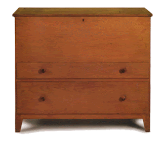
Many times the design has a greater meaning and purpose. For instance, the American Shaker movement in furniture. The Shakers were a religious group who believed in plain living. Living without embellshiment in their clothing, daily life and even in their furniture. Their furniture lived by the three p's: Plain, Price and Practicality.3 The furniture was not only utilitarian, but it was well crafted and stood as an example of their religious beliefs.  The form of their inspired furniture is the look and shape of it, the purpose is it's efficiency.
3 "Who Were The Shakers?" About.com Antiques. Web. 07 Apr. 2012. http://antiques.about.com/od/furniture/a/ShakerFurniture012310.htm
4 "Pigeon Vintage: June 2009." Pigeon Vintage. Web. 08 Apr. 2012. <http://pigeonvintage.blogspot.com/2009_06_01_archive.html>.


1"Design." Merriam-Webster. Merriam-Webster. Web. 08 Apr. 2012. http://www.merriam-webster.com/dictionary/design.