A designed journey
Tuesday, June 12, 2012
FINAL PROJECT
As you can see from my final project, the client enjoys traditional elements of design with a touch of bohemian and natural elements.
The sofa I have chosen is traditional in design. Covered with a light sage green fabric, it adds a modern flair, however with the fabric having harlequin lines accented with fabric buttons, it brings a retro 1950's feel to the room.
The accent chair (which would be repeated on each side of the chair for traditional symmetrical balance) is traditional but sleek in design. The fabric chosen for these chairs showcases overlapping shapes enforcing the Space of the design.
The bohemian style of the accent chair fabric is repeated on the sofa pillows and based with the dark burgundy fabric in the upper right hand corner of the board.
The upper left corner of the board shows the lined gold sheer fabric to be used for curtains.
The artwork behind the sofa is original in design. The circles are painted on cedar planks and are a blue in color that matches the print on the accent chairs. The burgundy paint matches the burgundy pillows on the sofa.
This design shows balance in the placement of the furniture, along with the pillow placement and the art work.
Line is shown in the curtain fabric, and the art work.
Space is shown in the placement of the furniture as well as the overlapping shapes in the accent fabric as well as the art work.
FINAL PROJECT JOURNAL
My final assignment was to design a project that incorporated two elements of design and one principle of design. The basis of this project is my future career, interior design. My design fundamentals chosen were: Space, Line & Balance.
I designed a small living room set up example board for a client who enjoys tradition but loves natural materials and bohemian designs.
I gave myself three days to complete this project.
Day 1: Trip to JoAnn Fabrics for fabric samples, assessed fabrics to decide which would work for my project.
Day 2: Return trip to JoAnn Fabrics to purchase foamcore board, scrapbooking paper to use as example of wall paint. Adhesive.
Day 3: Design board. Attach wall color example, attach fabric swatches. Attach printed out and colored examples of furniture, design wall art to hang behind sofa.
Revisions:
Many revisions occurred during this process; several in JoAnn fabrics when choosing wall paint color. Several in JoAnn fabrics, when I liked a certain material but then found out the material was not suitable for use on sofas or chairs. Other revisions were done during the final design process when I was once again choosing between fabrics. Not counting the many revisions done in my mind, prior to even stepping into the store to obtain materials.
Assessment: 100%
I have created a design representative of the Space, Line and Balance design fundamentals. I have presented it in such a way as to show the process of interior design. I have documented my process.
all photos on page: brendabrowning. photo. 2012
Saturday, June 2, 2012
Chapter 13... let there be COLOR!!!
Additive and Subtractive color systems

"HTML Color Chart Codes: Deciphering the Meaning." Bright Hub. Web. 02 June 2012. http://www.brighthub.com/internet/web-development/articles/103020.aspx.
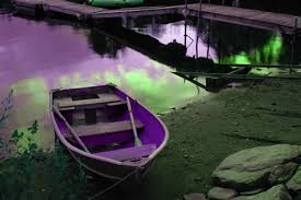
"Adobe CS Tutorials - Dreamweaver, FIreworks, Photoshop, Flash and Coldfusion." Adobe CS Tutorials - Dreamweaver, FIreworks, Photoshop, Flash and Coldfusion. Web. 02 June 2012. http://www.communitymx.com/content/article.cfm?cid=0da63.
Changing the value of a color
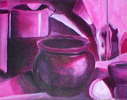
"Monochromatic Still Life by ~laurichg on DeviantART." Monochromatic Still Life by ~laurichg on DeviantART. Web. 02 June 2012. http://laurichg.deviantart.com/art/Monochromatic-Still-Life-1764289.
Intensity of Color
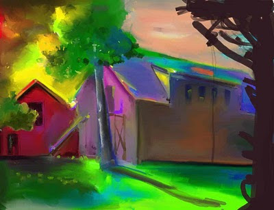
"Ken's Sketch Journal: Color Intensity Study." Ken's Sketch Journal: Color Intensity Study. Web. 02 June 2012. http://kfostersketch.blogspot.com/2009/12/color-intensity-study.html.
Warm and Cool Colors

"Color Quiz! Are You Warm or Cool Colored? The Color Cure." Apartment Therapy. Web. 02 June 2012. http://www.apartmenttherapy.com/color-quiz-are-you-warm-or-coo-152079.
Atmospheric perspective with color
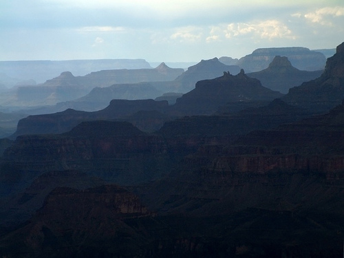
"130 Maggie Fields." : Illusion of Space by Atmospheric Perspective (38). Web. 02 June 2012. http://maggiefieldsdesign.blogspot.com/2011/03/illusion-of-space-by-atmospheric.html.
Complementary colors

Billaday. "Complementary Colors Mailbox." Flickr. Yahoo!, 20 Jan. 2008. Web. 02 June 2012. http://www.flickr.com/photos/billselak/2206739498/.
Triadic Colors

"TileTramp." TileTramp. Web. 02 June 2012. <http://tiletramp.com/2011/05/23/design-basics-color-schemes-via-color-wheel/>.
"HTML Color Chart Codes: Deciphering the Meaning." Bright Hub. Web. 02 June 2012. http://www.brighthub.com/internet/web-development/articles/103020.aspx.
"Adobe CS Tutorials - Dreamweaver, FIreworks, Photoshop, Flash and Coldfusion." Adobe CS Tutorials - Dreamweaver, FIreworks, Photoshop, Flash and Coldfusion. Web. 02 June 2012. http://www.communitymx.com/content/article.cfm?cid=0da63.
Changing the value of a color
"Monochromatic Still Life by ~laurichg on DeviantART." Monochromatic Still Life by ~laurichg on DeviantART. Web. 02 June 2012. http://laurichg.deviantart.com/art/Monochromatic-Still-Life-1764289.
Intensity of Color

"Ken's Sketch Journal: Color Intensity Study." Ken's Sketch Journal: Color Intensity Study. Web. 02 June 2012. http://kfostersketch.blogspot.com/2009/12/color-intensity-study.html.
Warm and Cool Colors
"Color Quiz! Are You Warm or Cool Colored? The Color Cure." Apartment Therapy. Web. 02 June 2012. http://www.apartmenttherapy.com/color-quiz-are-you-warm-or-coo-152079.
Atmospheric perspective with color

"130 Maggie Fields." : Illusion of Space by Atmospheric Perspective (38). Web. 02 June 2012. http://maggiefieldsdesign.blogspot.com/2011/03/illusion-of-space-by-atmospheric.html.
Complementary colors
Billaday. "Complementary Colors Mailbox." Flickr. Yahoo!, 20 Jan. 2008. Web. 02 June 2012. http://www.flickr.com/photos/billselak/2206739498/.
Triadic Colors
"TileTramp." TileTramp. Web. 02 June 2012. <http://tiletramp.com/2011/05/23/design-basics-color-schemes-via-color-wheel/>.
Chapter 12... What's the Value?
Value is an artistic term for light and dark contrast.

"Sketch a Horse." About.com Drawing / Sketching. Web. 02 June 2012. http://drawsketch.about.com/od/learntodrawhorses/ss/how-to-sketch-horses_10.htm.
Value contrasts
The relationship between dark and light. It's the only way we can percieve anything. We can read this writing because its value in accordance to the white page.

http://quizlet.com/2931297/art-department-vocabulary-list-flash-cards/

"Hotel Design Blog." Hotel Design Blog. Web. 02 June 2012. http://hoteldesignmag.com/.
VALUE EMPHASIS

"Monday, February 6th, 2012ASK HASKELL: What Is Correct the Height for a Kitchen Backsplash?" Blog. Web. 02 June 2012. http://www.haskellinteriors.com/blog/page/3/.
Chiaroscuro

"Chiaroscuro by ~Oak-T on DeviantART." Chiaroscuro by ~Oak-T on DeviantART. Web. 02 June 2012. http://oak-t.deviantart.com/art/Chiaroscuro-144709854.
Value and aerial perspective

"Jim Leggitt / Drawing Shortcuts." DRAWING BIG! Making a 2'x5' Aerial Perspective -. Web. 02 June 2012. http://jimleggitt.typepad.com/jim-leggitt-drawing-shortcuts/2011/04/drawing-big-making-a-2x5-aerial-perspective.html.
Shading

"Time Off (Cowboy - Pencil Drawing)." Time Off (Cowboy - Pencil Drawing). Web. 02 June 2012. http://printsforsale.ca/gallery/buy_denis_mayer_prints/time_off__cowboy.
"Sketch a Horse." About.com Drawing / Sketching. Web. 02 June 2012. http://drawsketch.about.com/od/learntodrawhorses/ss/how-to-sketch-horses_10.htm.
Value contrasts
The relationship between dark and light. It's the only way we can percieve anything. We can read this writing because its value in accordance to the white page.
http://quizlet.com/2931297/art-department-vocabulary-list-flash-cards/
"Hotel Design Blog." Hotel Design Blog. Web. 02 June 2012. http://hoteldesignmag.com/.
VALUE EMPHASIS
"Monday, February 6th, 2012ASK HASKELL: What Is Correct the Height for a Kitchen Backsplash?" Blog. Web. 02 June 2012. http://www.haskellinteriors.com/blog/page/3/.
Chiaroscuro
"Chiaroscuro by ~Oak-T on DeviantART." Chiaroscuro by ~Oak-T on DeviantART. Web. 02 June 2012. http://oak-t.deviantart.com/art/Chiaroscuro-144709854.
Value and aerial perspective
"Jim Leggitt / Drawing Shortcuts." DRAWING BIG! Making a 2'x5' Aerial Perspective -. Web. 02 June 2012. http://jimleggitt.typepad.com/jim-leggitt-drawing-shortcuts/2011/04/drawing-big-making-a-2x5-aerial-perspective.html.
Shading
"Time Off (Cowboy - Pencil Drawing)." Time Off (Cowboy - Pencil Drawing). Web. 02 June 2012. http://printsforsale.ca/gallery/buy_denis_mayer_prints/time_off__cowboy.
Chapter 11...It's an ... ILLUSION
STILLNESS

"Why Quiet Stillness = Inner Peace and Tranquility." An Island Perspective. Web. 02 June 2012. http://islandperspective.com/2010/03/10/why-quiet-stillness-inner-peace-and-tranquility/.
ARRESTED MOTION

"Rafting on the Waterfalls in Umbria, Italy." Italy. Web. 02 June 2012. http://www.lifeinitaly.com/tourism/umbria/rafting.asp.
Suggesting motion
repeated figures
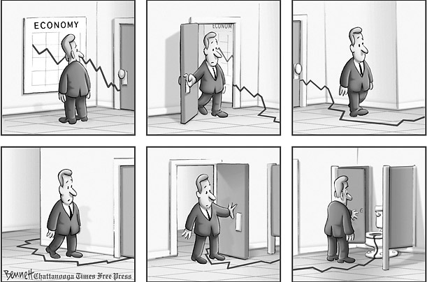
"130 Cate Brown." : Illusion of Motion by Repeated Figure. Web. 02 June 2012. http://catebrown18.blogspot.com/2011/05/illusion-of-motion-by-repeated-figure.html.
FIGURE CROPPING

"Bevo Beat." Texas Longhorns: Football, Basketball, Baseball and More. Web. 02 June 2012. http://www.statesman.com/blogs/content/shared-gen/blogs/austin/longhorns/entries/texas_exes/.
Blurred Outlines

"45 Beautiful Motion Blur Photos | Smashing Magazine." 45 Beautiful Motion Blur Photos | Smashing Magazine. Web. 02 June 2012. http://www.smashingmagazine.com/2008/08/24/45-beautiful-motion-blur-photos/.
Multiple images

"Brown University." Movement and Motion: Rovan Installation Opens at Cogut Center. Web. 02 June 2012. http://news.brown.edu/pressreleases/2009/10/rovan.
"Why Quiet Stillness = Inner Peace and Tranquility." An Island Perspective. Web. 02 June 2012. http://islandperspective.com/2010/03/10/why-quiet-stillness-inner-peace-and-tranquility/.
ARRESTED MOTION
"Rafting on the Waterfalls in Umbria, Italy." Italy. Web. 02 June 2012. http://www.lifeinitaly.com/tourism/umbria/rafting.asp.
Suggesting motion
repeated figures

"130 Cate Brown." : Illusion of Motion by Repeated Figure. Web. 02 June 2012. http://catebrown18.blogspot.com/2011/05/illusion-of-motion-by-repeated-figure.html.
FIGURE CROPPING
"Bevo Beat." Texas Longhorns: Football, Basketball, Baseball and More. Web. 02 June 2012. http://www.statesman.com/blogs/content/shared-gen/blogs/austin/longhorns/entries/texas_exes/.
Blurred Outlines
"45 Beautiful Motion Blur Photos | Smashing Magazine." 45 Beautiful Motion Blur Photos | Smashing Magazine. Web. 02 June 2012. http://www.smashingmagazine.com/2008/08/24/45-beautiful-motion-blur-photos/.
Multiple images
"Brown University." Movement and Motion: Rovan Installation Opens at Cogut Center. Web. 02 June 2012. http://news.brown.edu/pressreleases/2009/10/rovan.
Friday, May 18, 2012
It's an illusion......
The Picture plane is the two dimensional surface on which shapes are organized into a composition.

Koktelashs, The Early Years: 1911-1929 Early in the Teens Tanalian Point Saw a Steady Stream of Dena'ina Visitors Coming and Going between Old Nondalton and Even the Stony River Country (the. National Parks Service. National Parks Service, 20 Apr. 2012. Web. 18 May 2012. <http://www.nps.gov/lacl/historyculture/tanalian-point.htm>.
Foreshortening is a distortion of a shape due to perspective where in an object appears shorter than we know it to be. (Comes forward/Bigger - Further away/Smaller)

Vertical location is the spatial device in which elevation on the page or format indicates a recession into depth. The higher the object is on the picture plane, the further back it is assumed to be.

"Bell Tower." Behind The Scenes. Web. 18 May 2012. <http://blog.chinatraveldepot.com/tag/behind-the-scenes-2/>.
Aeriral perspective is the perception of less distinct contours and value contrasts, as forms recede into the background, colors appear to be washed out in the distance or take on the color of atmosphere.
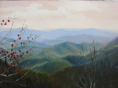
"Blue Ridge, Daily Painter: Janet Wimmer." : Aerial Perspective. Web. 18 May 2012. <http://janetwimmer.blogspot.com/2010/07/aerial-perspective.html>.
Multipoint perspective is the system of spatial illusion with different vanishing points for different sets of parallel lines.
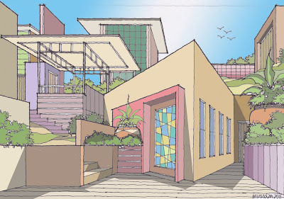
Amplified perspective is the dynamic and dramatic illusionistic effect. Created when an object is pointed directly at the viewer.

"130 Stephanie Sexton." : Space (36-42). Web. 18 May 2012. <http://130stephaniesexton.blogspot.com/2011/04/space-36-42.html>.
Isometric projects are spatial illusions when lines receding on a diagnoal remain parrallel instead of converging toward a common vanishing point.
Ambiguity is the obscurity of motif or meaning.
Koktelashs, The Early Years: 1911-1929 Early in the Teens Tanalian Point Saw a Steady Stream of Dena'ina Visitors Coming and Going between Old Nondalton and Even the Stony River Country (the. National Parks Service. National Parks Service, 20 Apr. 2012. Web. 18 May 2012. <http://www.nps.gov/lacl/historyculture/tanalian-point.htm>.
Foreshortening is a distortion of a shape due to perspective where in an object appears shorter than we know it to be. (Comes forward/Bigger - Further away/Smaller)
"Stock Photo - The Calf Puts out the Tongue in a Comic Foreshortening." 123RF Stock Photos. Web. 18 May 2012. <http://www.123rf.com/photo_8031000_the-calf-puts-out-the-tongue-in-a-comic-foreshortening.html>.
Size relationships to achieve space are important in design. It's creating an object that looks closer (bigger) or further away (smaller).Vertical location is the spatial device in which elevation on the page or format indicates a recession into depth. The higher the object is on the picture plane, the further back it is assumed to be.
"Bell Tower." Behind The Scenes. Web. 18 May 2012. <http://blog.chinatraveldepot.com/tag/behind-the-scenes-2/>.
Aeriral perspective is the perception of less distinct contours and value contrasts, as forms recede into the background, colors appear to be washed out in the distance or take on the color of atmosphere.

"Blue Ridge, Daily Painter: Janet Wimmer." : Aerial Perspective. Web. 18 May 2012. <http://janetwimmer.blogspot.com/2010/07/aerial-perspective.html>.
Multipoint perspective is the system of spatial illusion with different vanishing points for different sets of parallel lines.

Amplified perspective is the dynamic and dramatic illusionistic effect. Created when an object is pointed directly at the viewer.

"130 Stephanie Sexton." : Space (36-42). Web. 18 May 2012. <http://130stephaniesexton.blogspot.com/2011/04/space-36-42.html>.
Isometric projects are spatial illusions when lines receding on a diagnoal remain parrallel instead of converging toward a common vanishing point.
Ambiguity is the obscurity of motif or meaning.
Pattern & Texture
Pattern, we see it everywhere. In nature, we can see a pattern in the way petals form on a rose, the way leaves form on a tree limb. Pattern is everywhere. It's the repetition of a visual element or module in a regular and anticipated pattern.
Texture on the other hand, is the survace quality of objects that appeals to the tactile sense, for instance..the thorn on the rose, the bark on the tree.
Pattern can create an illusion of texture, but texture itself is associated with touch.

PATTERN
Thompson, Jim. "Budding Beauties." - 2011-05-31 15:17:00. Web. 18 May 2012. http://www.interiordesign.net/article/540873-Budding_Beauties.php.

TEXTURE (tactile texture)
"SitePoint » Learn CSS | HTML5 | JavaScript | Wordpress | Tutorials-Web Development | Reference | Books and More." Elements Of Design: Texture. Web. 18 May 2012. http://www.sitepoint.com/elements-of-design-texture/.
Tacticle texture is the use of materials to create a surface that can be felt or touched can be used in many ways in interior design by utilizing blankets, arts, etc. The picture above also shows an example of this tacticle texture.
A collage is artwork created by assembling and pasting a variety of materials onto a two dimensional surface. Can be used in original art. Here is an example:
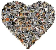
"Collage." Citizen Schools Blog. Web. 18 May 2012. http://blog.citizenschools.org/ctnation/2010/07/15/collage/.
Verisimilitude is the accuracy or faithfulness in depiction or representation. To create something true or believable, believable in its environment.
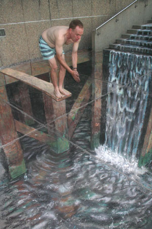 VERISIMILITUDE & Trompe L'oeil
"This and That and More of the Same." : Amazing 3D Chalk Sidewalk Art Images from Julian Beever. Web. 18 May 2012. http://thisandthatandmoreofthesame.blogspot.com/2012/05/amazing-3d-chalk-sidewalk-art-images.html.
Trompe L'oeil
A fench term meaning "to fool the eye" objects are sharp focus and delieated with meticulous care to create an artwork that almost fools the viewer into believing the images are actual objects.
Texture on the other hand, is the survace quality of objects that appeals to the tactile sense, for instance..the thorn on the rose, the bark on the tree.
Pattern can create an illusion of texture, but texture itself is associated with touch.
PATTERN
Thompson, Jim. "Budding Beauties." - 2011-05-31 15:17:00. Web. 18 May 2012. http://www.interiordesign.net/article/540873-Budding_Beauties.php.
TEXTURE (tactile texture)
"SitePoint » Learn CSS | HTML5 | JavaScript | Wordpress | Tutorials-Web Development | Reference | Books and More." Elements Of Design: Texture. Web. 18 May 2012. http://www.sitepoint.com/elements-of-design-texture/.
Tacticle texture is the use of materials to create a surface that can be felt or touched can be used in many ways in interior design by utilizing blankets, arts, etc. The picture above also shows an example of this tacticle texture.
A collage is artwork created by assembling and pasting a variety of materials onto a two dimensional surface. Can be used in original art. Here is an example:
"Collage." Citizen Schools Blog. Web. 18 May 2012. http://blog.citizenschools.org/ctnation/2010/07/15/collage/.
Verisimilitude is the accuracy or faithfulness in depiction or representation. To create something true or believable, believable in its environment.
 VERISIMILITUDE & Trompe L'oeil
"This and That and More of the Same." : Amazing 3D Chalk Sidewalk Art Images from Julian Beever. Web. 18 May 2012. http://thisandthatandmoreofthesame.blogspot.com/2012/05/amazing-3d-chalk-sidewalk-art-images.html.
Trompe L'oeil
A fench term meaning "to fool the eye" objects are sharp focus and delieated with meticulous care to create an artwork that almost fools the viewer into believing the images are actual objects.
Subscribe to:
Comments (Atom)


